Thursday, 23 May 2013

Jenny saville CHC Essay

                                                                                  Propped 
                                                                        Jenny Saville  
1992 
7 x6 Ft. x 1.82 M  
Jenny Saville is an English born artist whose career rocketed in 1994 when Charles Saatchi displayed her work only two years after she graduated from university. I feel Saville’s style can be explained initially in two words: dynamic and controversial. Her gigantic paintings often top six foot in height (which dominate gallery space as shown in the picture to the left) with visible flowing dynamic brush marks of clear contrasting colours.
 
The image is in a rectangle format, the back ground is neutral, light to dark. The image shows an extremely large naked woman, (known to be Jenny Saville) she is looking down from a gigantic height with an expression that conveys despair, discomfort and vulnerability, wearing nothing but a white pair of shoes, sitting on a stool grasping at her large thighs (the image on a whole is very fleshy). Her breasts are slightly exposed,  her knees and body have clearly been over exaggerated as they protrude of the image, her head is cropped too small to fit the body (this also over exaggerates the perspective of the image and enhances the fore shortening). Writing has been scratched though the image (scraffito technique), back to front to reflect a mirror, the text says; 'If we continue to speak in this sameness - speak as men have  spoken for centuries, we will fail each other again . . .’ I think this means if we continue to listen to men about how we look we will never really know ourselves.
Jenny Saville’s work is compared to Lucian Freud(as shown to the right) as it argued they share a raw interpretation of the human body especially the female form. It has been quoted; “(1)Gender is what distinguishes Saville from other paint-obsessed re-presenters of the naked human body. To my eye, no other artist in recent memory has combined empathy and distance with such visual and emotional impact”
Her greatest influences are Francis Bacon (displayed left)  and Willem de Kooning (below on the right)... Jenny Saville has quoted; ‘'(2)The marriage of Bacon’s figurative skills and de Kooning’s painting skills would make the best painter who ever lived.'’
To me this means she admires both of their unique interpretations of the abstract movement, and applies this to her own practice;
(3)I use directional mark-making to move your eye around the flesh.” all her images use this technique. Her work often contradicts the 'norm of beauty' as she uses larger women most are obese, these images are then exaggerated further; her work also explores deconstruction through cosmetic surgery; (photographs and paintings to explore this.)
My Work In the Style of Jenny Saville;


These piece's
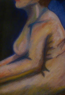
are from my life drawing studies created in 2011, here I have attempted to use Jenny Saville's fluid mark making, excessive use of tone and colour, the two uses oil pastel, whilst the other (laying down image) uses oil bars, these images are just over a2 in size apart from the cropped image of the breast which s just under a3 I think these images are really successful, I'd like to do them too a much larger scale.


References;
Quote 1- Sourced from;
Linda Nochlin, Art in America, March 2000- Jenny Saville- interviewed by Simon Schama(Author), published by Saatchi gallery Publication Date: 12 Oct 2005 | ISBN-10: 0847827577 | ISBN-13: 978-0847827572

Quote 2- Sourced from;
Art Bank Website - Jenny SAVILLE Biography
Brain Juice website- Jenny Saville's Biography
Is also mentioned in The Saatchi gallery's publish book on Jenny Saville titled 'Jenny Saville' - Simon Schama (Author) -Publication Date: 12 Oct 2005 | ISBN-10: 0847827577 | ISBN-13: 978-0847827572


Quote 3- Sourced from;
The Saatchi Gallery website- Jenny Saville- Contemporary artist, Passage;

Rant It Up – The Politics Of Flesh
Pictify- 'Your Social Art Network'

Monday, 18 March 2013

The Ruskin Experience, Fall of the Niksurtes

Project title: "...I guarantee you will see"

As you are the ‘de facto’ and ‘legitimate’ bearers of the final memories of Ruskin Hall School of Art and Design, your project is to produce a tourist
attraction or theme park set in the distant future where tourists will pay to experience ‘a day in the life of Ruskin Hall’.

Context

*This is the story produced through the brainstorming session in class. Students decided on the following as a context for a future museum at Ruskin Hall. 
(a) We have concluded that our building in the distant future exists as a museum.
(b) Its name (pending) is: The Ruskin Experience, the fall of the Niksurites
(c) It is said that in it’s time Ruskin Hall had a lot more going on than just your average art school. In 2013, a scandal took over the news for months as police and journalists unravelled evidence that students from the art and design course were running a secret sect called Niksurites (derives from ‘Ruskin’ in reverse).
Inside, investigators found secret spaces, objects, visual material and accounts of the events that took place…
A museum has now been created in the year 3089 where visitors can experience what it was like being part of the sect 1,076 years ago. Time has blurred truth from fiction and many stories have been told since…what is true and what isn’t still remains a mystery


My Role;

My role in this project is that of a journalist/ news reporter as the story is uncovered I am first on the scene to gain information as to what is really going on in this secret sect, with witness reports and interviews from parties involved, I intend to make a series of new papers and various articles all of which have been fabricated/ distorted from the original story.

For this I will research into current new and affairs and look at various types of news papers and different articles.


Initial research;


Looking at Ruskin Hall...

Ruskin Hall was the first public building in Bournville, and it was originally used as a social centre for the village. It opened in 1903, Ruskin Hall  as a place to teach Arts and Crafts to the community of Bournville, and to maintain the values and ideas of John Ruskin, a leading art critic/artist of the Victorian era.


Old photograph shows original building, this building is smaller than the Ruskin hall we know today;

The school was refurbished for £6 million in 2002 and reopened on 21 October 2002, precisely 100 years after the foundation stone for Ruskin Hall was laid. It is home to the International Project Space, and is the site of Birmingham's annual Creative Partnerships exhibition, a showcase of contemporary and visual art produced by local school students


Mind mapping/Idea Jotting 


initial research on newspapers templates;

 Naming news papers?
originally I was going to create a whole new news paper called the Bournville Bugle, this was my first attempt at planning a news paper;

not very effective as I tied to produce this document on word, it has the basics to the story I have imagined up, but it looks to plain and boring.


Looking at Layout...


 Headlines...

Cult EXPOSED!
Secret Sect Uncovered!
Play with the words discovered, uncovered, exposed.

EXPOSED! - grabbing viewers attention with one word liners.
Playing with fonts; all Fonts (EXPOSED) are wrote in bold and at 48 pts.


Looking into established papers...


 Comparing the same story;


Making My Trial layout...

I have never used illustrator or any type of illustrating program before...
I was tempted to just use Photoshop to create all my work as I have a good understanding of the program and it's capabilities.
Playing with stories and advertisements


 Looking at detail- price issues numbers, date


Playing with font, text size and position.
Arial Black
Georgia

Playing with Layouts...


Creating an Article.


Finished Result...


Trial Paper 2;


Final Trial, Issue 2 


 Newspaper trial 3;


Text Layout/format and sizing- 

Playing with two different Headlines


Adding a Photography element to my Project;


Sketches;
originally I wanted to take two attention capturing photographs, the one of the university taped up with novelty police tape and the second being someone from the 'sect' being arrested, however, with out the police uniform I knew the second wouldn't be possible so I went for somebody 'sect member' pushing cameras and reporters away, hiding their head/wearing a hoody.

Original biro pen sketch

Edited on photoshop

 this image was attempted to draw using Photoshop, if I'd have paid more attention to detail and not done it in 5 minutes I believe it could have turned out to look good.
 Police tape in door way.


The Daily Mail- looking at layouts, and creating initial trial.


The Times- Looking at Layout- initial trial,


My Photography and Photoshop police tape;


My police Tape didn't arrive in time, and as I really wanted the image to have police tape across the door like an actual crime scene I decided to use Photoshop


My Photoshop trials and turnouts;


As you can see my initial attempts looked fake and unrealistic,

 
 'Hidden sect member.'


Photoshopped creation;
Raw, unedited image, hand has ben laced on top of body image.
 
 
adding details with blurring via- depth of field.
 
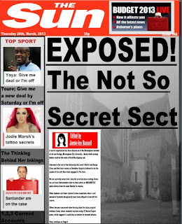
My Final newspapers;
 

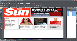
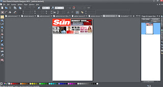
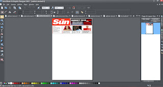
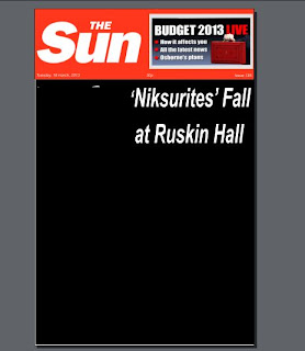
The Sun;


Sun newspaper without the police tape,


 Headline/ font trials;


Leading up to Final;


Final layout style.
                                                  
 
Final Layouts;


I have decided that I wanted to combine both of the papers.

Final;


The Times;


 Final;

 
This newspaper was much easier to create, an it didn't need all the detail that the sun did.
 

The Daily Mail;


I decided to scrap this idea as it looked too much like my SUN newspaper
 

Final;